


Autumnal nail polish colors for everyone
Create a moody look that fits your personal palette

I have always loved any detail elements added to a look because I think they create a lot more impact than the “big elements” of an outfit. It’s the way the sole of your shoe matches the upper, or the unexpected lip color that contrasts with your outift, or a personal favorite, the perfect nail color. I usually don’t paint my nails that often, but times they are a changing and I’ve been prioritizing it more lately. Knowing your seasonal color palette is more or less crucial depending on your style goals, but I have to say I think harnessing your color palette is underutilized when it comes to picking nail polish colors. It sits so close to the skin that the impact it has when it harmonizes with your undertones is surprisingly strong.
The time of year I most want an impactful nail color is Autumn. It feels cozy, and magical. Sometimes it feels broody and dark. We bust out the plaid and the cozy textures of wool and leather. As we curl our fingers around a hot cuppa we see our nail color more often, and as things are dying around us or wet and dreary, the impact of a little jolt of color feels warming. I think we also get nostalgic and introspective, and all of these elements lend themselves so well to the creative expression of a fresh manicure.
SUMMER
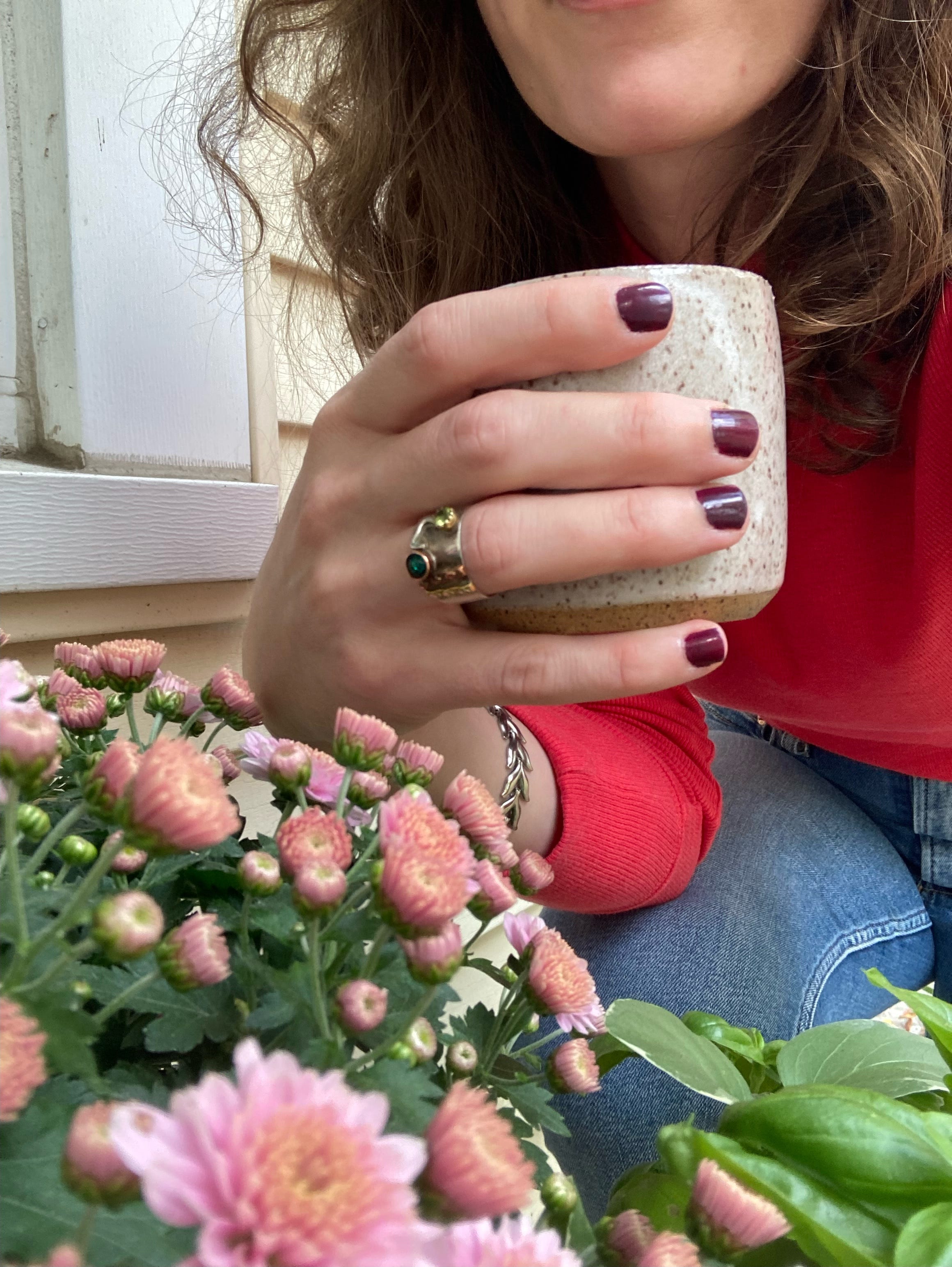
But some personal color palettes aren’t classically Autumnal.
I am a True Summer according to the International Image Institute system of color analysis, and although there are some moody and smoky colors, there aren’t any of the warm colors of Autumn. In the past I’ve enjoyed brown nail polish, but I really wanted to find something more in line with my palette, and landed on a burgundy color that leans far more purple than I would have normally chosen for myself. But I am honestly loving it so much. It feels fresh and surprising, perfectly moody, and honestly just like more of me is unlocked, if that makes sense. If you’re not a fan of purple, finding a color that leans a little more in the reddish/wine direction can also be a great choice for summers. Or if you love purple, going with a classic grape or misty lilac would be perfect. Another summer palette option especially suited to Light Summers is a misty or smoky blue gray, which I think would feel surprisingly well-suited to Autumn, reminiscent of bonfire smoke or steam coming from a piping hot kettle.
SPRING
For those in the Spring palette, a palette defined by warmth, brightness, and lightness, the challenge is to find something that has that moody nostalgia. What is the Spring palette version of Gilmore Girls? I love navy for a spring palette, as it evokes a bit of that dark academia, school uniforms, and a star studded night sky. If you want something a bit more natural, any cappuccino/latte brown color would be perfection. Who doesn’t want to be reminded of a cozy coffee drink every time they look down at their hands?
AUTUMN
Okay so this one might seem easy, and it kind of is, but I’ll offer some of my favorite suggestions anyway. I mentioned earlier that I have loved a brown nail polish for years, and its not going anywhere anytime soon. A rich chocolate brown will never let you down. I notice that a lot of people shy away from oranges and yellows, but if you’re an Autumn, feel free to embrace these colors. An earthy pumpkin color or golden yellow are perfect for you. If you want something a little more subtle, a rusty or orange red color is classic. An unexpected and on-trend color for Autumns is an olive green.
WINTER
Winter has all the depth and darkness of Autumn, but has none of the warmth. Instead of a rusty orange, opt for a berry red. Instead of olive green, go for an emerald or jade. And although October has come and gone, black is a great color for Winters to embrace that mysterious Autumnal spirit.
There is no wrong way to capture the earthy, darkening feel of Autumn, so take the opportunity to try something out. What color are you reaching for in this season?
Until soon,
MDS
